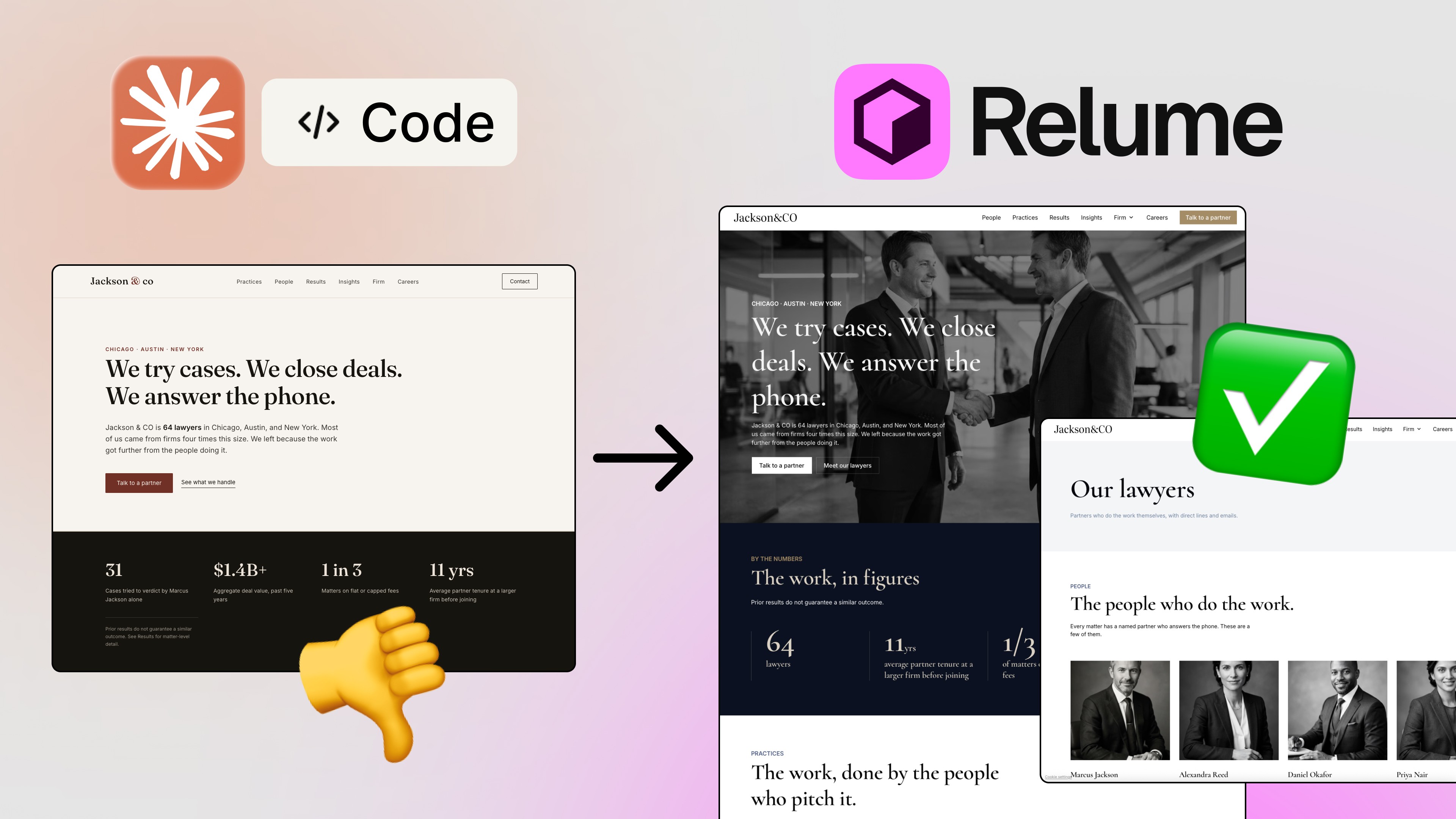
Small but important detail that trips people up: this lives in code mode, not design mode. Open Claude, switch to code mode, and connect a folder — that’s where your files will live and where the work happens.
Then you invoke it like any other skill: type a forward slash and design. You’ll see a few options for what you can point the skill at. For my first test, I kept it simple and used plain design.
That folder connection isn’t a formality. It’s the reason the output is portable — everything you generate ends up as real files you can export, hand off, or feed back into Claude Code to build the actual product.
My prompt was almost embarrassingly short: “Use design skill, analyze my website and create design system from it.”
I used Sonnet 5 with high effort here — you don’t need Opus for extraction work like this, and it’s worth being deliberate about which model you spend on which task. It analyzed the site and produced a design system artifact.
What appeared on the right was a canvas full of artboards. If you’ve spent any time in Figma, the muscle memory transfers instantly. Zoom in, click an artboard, inspect it — and export it as PNG or HTML.
The system it pulled from my site included the color palette, typography scale, logo treatment, buttons and controls including tag styles, and foundations for radius and spacing — small at 12px, medium at 24px, large at 28px, plus circle item spacing.
📌 I send more Claude Code + design-system workflows here: newsletter — practical, not “one prompt and done.”
That last one is the tell. Colors and fonts are easy to scrape. Spacing tokens and radius values mean it read the structure of the design, not just the surface. And because everything is selectable on the canvas, I could modify any of it before moving on.
The HTML export is the part designers should pay attention to. You can export a frame as code with images intact, then point Claude Code at that frame and have it build the real thing. The gap between “design artifact” and “working front end” gets very small.
Next: design layouts for a hotel booking app I named Hotelios.
Here’s where I hit an honest limitation, and it’s a human one, not an AI one. I don’t design travel apps every day. I wasn’t confident about the correct user flows or the established best practices in that category. An AI that confidently invents a booking flow is worse than no AI at all — you end up with something that looks plausible and converts terribly.
So I fed it real references using the Mobbin MCP — a library of real, shipped app design with over 600,000 screens, 1,500 industry-leading apps, and over 300,000 user flows. Not portfolio concepts, actual products people use. I went into the travel category, pulled up Booking.com, and used that as my reference.
My prompt combined all three ingredients: design the home, hotel search, and hotel results screens for Hotelios, use my design system for styles, and use Mobbin MCP to analyze the reference for those screens while keeping their best practices.
I used Opus 5 with high output for this one — more design reasoning required, so it earns the bigger model.
Claude pulled the actual booking flow from Mobbin: homepage, search screens, results screens. It understood the sequence, not just the individual layouts. Then it applied my fonts and colors from the design system I’d made ten minutes earlier, and delivered three screens with notes explaining its decisions.
The generated home screen had a tab row: stays, flights, cars. My app doesn’t do car rentals — so I selected “cars” and deleted it, opened the properties panel, set the container to fill, and applied justify center. Exactly like Figma.
I nudged the promo banner higher up the page to free that slot for an ad, and changed a rating color with the color picker — worth flagging that it didn’t automatically pull that particular value from my design system, so I set it manually.
None of these are impressive AI moments. That’s the point. They’re boring, ordinary design decisions — and being able to make them after generation is what separates a tool from a demo.
Last test. I asked for an Instagram carousel using the same design system, with a cover, five slides, and a CTA to follow, on the topic of designing with Claude Code, plus five case studies. I asked for three variations to pick from.
It returned three genuinely distinct directions. Editorial Mono was clean, typography-led, and very white — well built, but too much breathing room for my taste. Ink Terminal was the same structure in dark mode, using my accent salad-green as the highlight color, with the final slide flipping to a full salad background — this was my favorite. Lime Blocks was completely different, borrowing the bento-style grid from my homepage and pulling through the blue from my site.
The cover slide picked up my name as a logo mark, added a slide counter, a next-slide affordance, and my website URL — all in my typography and colors. It did not add my Instagram handle, because I never asked it to. Fair enough. Prompt precision matters.
Editing worked the same way as the app screens: click into a text element, open the properties panel, and you get sizing, auto-layout properties, padding, typography — the whole panel. I bumped a headline to 40px and set it uppercase in about four seconds, then exported the slides as PNGs, ready to post.
Start with your own site. Extracting a design system from something real gives you a grounded foundation. Generating one from scratch gives you generic AI aesthetics.
Use code mode, not design mode, and connect a working folder first.
Match model to task. Sonnet for extraction and analysis; Opus for the heavier design reasoning. Don’t burn Opus on a color-palette scrape.
Feed it real references. Pairing the design skill with Mobbin MCP is the difference between plausible-looking screens and screens that follow proven flows.
Reference your design system file explicitly in every prompt. It won’t assume.
Ask for variations. Three directions cost one prompt and give you something to react to — far more useful than one “final” answer.
Expect to finish it yourself. Some values won’t inherit correctly. Budget five minutes of cleanup and stop treating that as a failure.
Export to HTML, then build. The design to code loop is the real unlock here.
No. And I don’t think it’s trying to be.
What the Claude Code design skill actually replaces is the ugliest part of the process: the blank canvas, the tedious first pass, the manual rebuilding of your own tokens for the fifth time this year. It got me from “I have a website” to “I have a design system, three app screens following a real booking flow, and three carousel directions” in a single session — with everything editable, exportable, and consistent with my brand.
The judgment is still yours. Knowing that the cars tab doesn’t belong, that the promo banner should move up, that Ink Terminal beats Editorial Mono for your audience — that’s the designer’s job, and it hasn’t gone anywhere. The machine got faster at the part that was never the interesting part.
FAQs
What is the Claude Code design skill?
How do I use the design skill in Claude Code?
Can Claude Code create a design system from an existing website?
Can I edit the designs Claude Code generates?
How does Mobbin MCP work with the Claude Code design skill?
See more from me in Google Search
Add sergeichyrkov.com as a preferred source to get my tutorials and articles highlighted in Top Stories and AI Overviews.