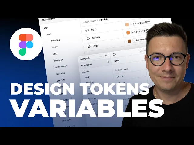
Introduction: Why Every Designer Needs a System
If you’ve ever worked on more than one screen in Figma, you’ve probably felt the chaos that comes with inconsistent colors, mismatched typography, and unclear spacing. That’s where design systems come in — and now, with Figma Variables, creating a scalable, flexible, and AI-ready design system has never been easier.
In this tutorial, we’ll go step-by-step through how to build a complete design system in Figma from scratch, using variables and design tokens.
You’ll learn not just how to make things look clean — but how to make your system understandable for both humans and AI tools like Figma Make, Cursor, Claude, or any code-connected workflow.
👉 Watch the full step-by-step video tutorial here:
What Are Design Tokens — and Why Do They Matter?
Design tokens are the foundation of a design system — small, reusable pieces of design data that define things like color, typography, spacing, and borders.
Instead of hardcoding a hex value or font size, tokens act as variables that designers and developers can both use. This means when you update a color or font, the entire project updates automatically.
In Figma, tokens are created and managed through variables, organized into collections like:
🎨 Base (core values like colors, spacing, type)
🔁 Aliases (contextual tokens like buttons, headings, or links)
🔤 Typography (font family, size, line height, spacing)
By setting this up correctly, you ensure consistency across your designs — and create a system that scales beautifully as your project grows.
Step 1: Structuring Your Design System in Figma
Before creating tokens, you need a logical structure. In the video, Sergey builds three main collections:
1. Base Collection
Contains the raw values — your foundational tokens.
These include:
Color palettes (primary, neutrals, accents)
Scale numbers (used for spacing, sizing, and grid)
Font families and weights
2. Aliases Collection
This is where tokens get contextual meaning — connecting your base colors and scales to real UI uses like:
Text colors (headings, body, disabled)
Surface and background colors
Buttons, borders, and icon colors
3. Typography Collection
A separate space to manage:
Font sizes for body and headings (H1–H6)
Line heights
Paragraph spacing
This structure keeps your design system clear, flexible, and scalable for both small projects and complex multi-page apps.
Step 2: Creating a Color System and Tokens
Color is the heart of every design system. Sergey begins by creating color shades — from light to dark — without relying on opacity.
Each color gets nine shades, labeled using the Tailwind-like scale (100 to 900).
Example:
Red-100– the lightest shadeRed-500– the main colorRed-900– the darkest tone
Why 100–900 Scale Works
This consistent naming helps developers and designers instantly understand which shade to use, while keeping flexibility for hover states, borders, and gradients.
After defining colors in the Base collection, Sergey creates groups for:
Primary colors (brand colors)
Neutrals (grays, black, white)
Accents (purple, green, blue, etc.)
Then, using the Aliases collection, he maps these to use cases like:
Text → Headings → Neutral-900Surface → Button → Red-500Link → Default / Hover / Visited
This ensures your design always uses tokens, not static color values.

Step 3: Setting Up Variables for Spacing and Scale
Consistency in spacing is what separates amateur layouts from professional design. Sergey uses the 8-point grid system, where every element’s size and spacing is divisible by 8 (or sometimes 4 for smaller details).
In Figma, he defines scale variables like:
Then connects these numbers to aliases for:
Spacing (SP4, SP8, SP16, etc.)
Radius (RD8, RD24...)
Borders (BR1, BR2...)
Using these tokens lets you adjust spacing globally later — no manual resizing needed.

Step 4: Building Typography Tokens
Typography often gets messy fast. Figma Variables now make it modular.
Sergey demonstrates how to create:
Font weights: Regular, Semi-bold, Bold
Font families: Separate for body and headings (e.g., Inter for both)
Font sizes: 12, 16, 20 for body; 32–64 for headings
Line heights & paragraph spacing: Matched to each size for perfect rhythm
He also shows how to use TypeScale tools to find balanced font sizes and ratios, then link them to your base scale numbers.
For example:
H1 → 64px, line height 64
H2 → 48px, line height 52
H3 → 40px, line height 48
Body → 16px, line height 24
These are stored in Figma Variables and linked across text styles — so updating one variable updates every heading instantly.

Step 5: Connecting Tokens to Components
Once all tokens are ready, Sergey builds real examples — like a button component — using only variables.
Create a button with text
Add padding using spacing tokens (e.g., SP16, SP24)
Apply background from alias →
Surface.Button.DefaultSet text color →
Text.Body.WhiteAdd border radius →
RD8Use typography variable →
Font.Body.Medium
Now you can duplicate, modify states (default, hover, disabled), and everything stays consistent — powered by your design tokens.
Step 6: Why This Matters for AI and Developers
Modern AI tools like Figma MCP or Cursor use design tokens to understand your design’s logic.
When your design system is variable-driven, AI can:
Recognize your color hierarchy
Generate consistent code
Adapt to dark/light modes easily
Maintain branding automatically
Plus, developers can export these tokens directly into code frameworks like Tailwind, CSS variables, or JSON tokens, making handoff seamless.
Actionable Takeaways
✅ Start small — define base colors, typography, and spacing first.
✅ Always name variables logically (use scales like 100–900).
✅ Use aliases to add meaning (text, surface, button).
✅ Build components only after variables are set.
✅ Reuse your system across multiple projects — it saves hours.
Conclusion
Setting up a Figma design system with variables and design tokens may take time upfront, but it pays off tenfold in consistency, scalability, and speed.
Once you build this foundation, every new screen, component, or project becomes faster and more reliable — and AI-powered tools will actually understand your design’s structure.
If you found this guide helpful, subscribe to my newsletter and YouTube channel for more tutorials on Figma, design systems, and modern UI workflows.
FAQs
What are design tokens in Figma?
How do Figma Variables improve design systems?
What’s the difference between base and alias collections?
Why use an 8-point grid system?
Can I use these tokens in code?


