Introduction
If you've input a prompt to design an interface with AI and didn't get what you were looking for, you are not the only one. AI-generated interfaces typically look unoriginal, uncreative, and uninteresting.
It's not AI that is the issue.
It's how the AI is given information.
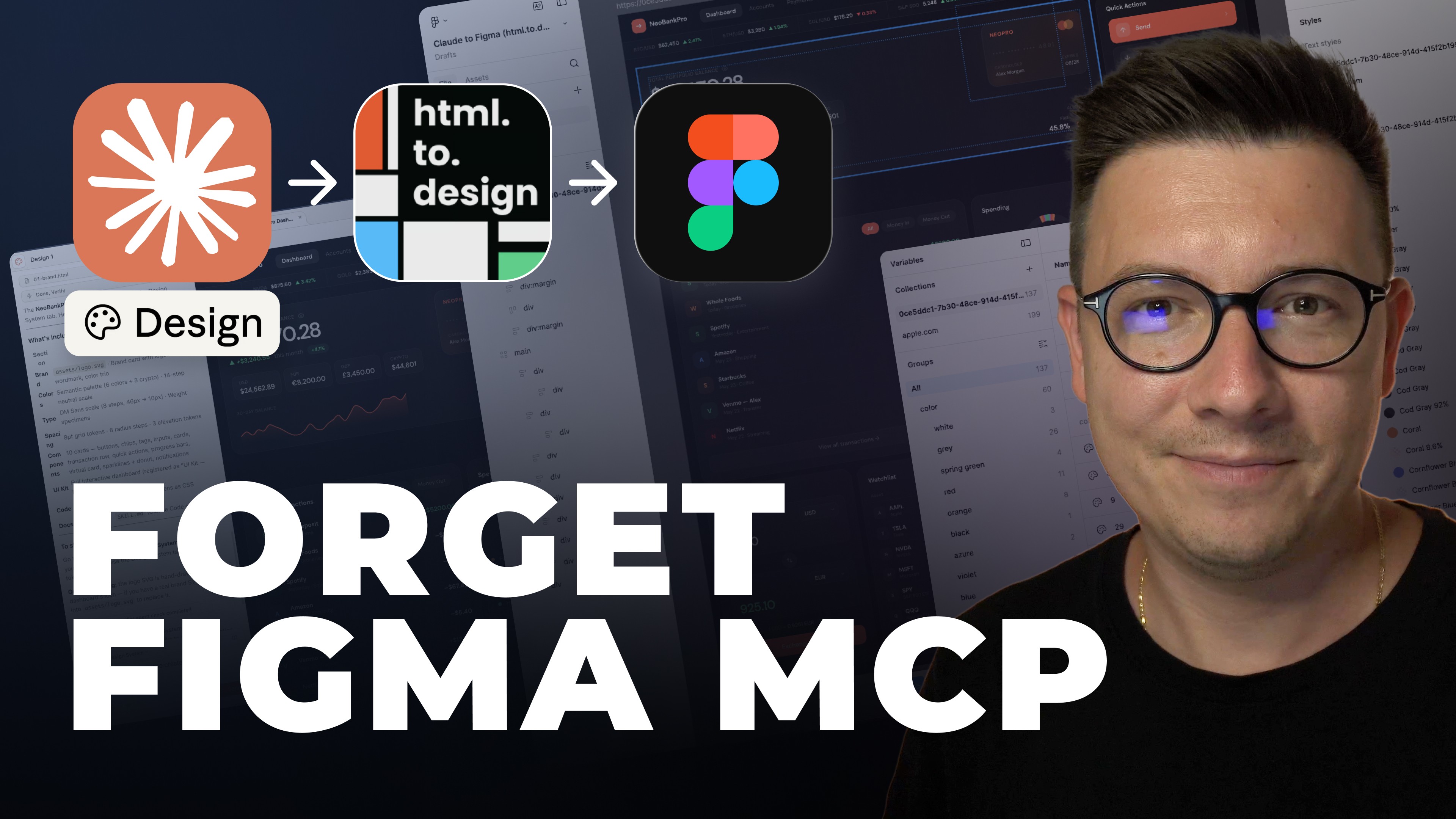
In this post you'll learn how to get and use UI design screenshots as reference points to teach AI tools, like Figma Make, to pull actual design elements from screenshots that you can modify into a design system that you can use to create great-looking professional designs. This method gets you above average designs from AI, rather than just plain average ones, without having to copy anything or make a lot of guesses.
By the end, you'll know more about:
The reasons prompt-based design doesn't work as well as you may think.
The optimal method for abstracting design screenshots to work with AI tools.
Creating a real design system from screenshots.
The fastest method for generating effective layouts for an application.

Why Most AI-Generated UI Designs Look Generic
Most people treat AI UI design tools as of they were magic.
You will see people simply typing in something like this:
Create a contemporary dashboard for a (random industry) business with a (random color) color scheme.
Then they will be shocked and surprised at how unoriginal and plain the design they received is!
Why Your AI Generated Designs Will Look Basic
Effective design never comes from a blank template.
Effective design comes from using references, inspiration, and patterns.
When you use a tool like Figma Make, Cursor, Lovable and simply tell the AI to design something for you from scratch you are asking the system to make guesses at:
Spacing and system layouts
Typography like headings and the format
The styles of each design element
Appropriate color combinations
This is why the result will be average at best.
Professional designers focus and apply references.
Why Giving The AI Designs To Copy Is The Most Effective Way To Innovate Designing
AI is better at analyzing a design that is already complete and made than they are at creating design from scratch.
Designs made by Figma Make, or any other AI design tools, contain complete sets of:
Commitment to a logical system of spacing
Proper font sizing and hierarchy
Thoughtful color combinations
Cohesiveness in the design elements
Clear and organized visual hierarchy
This is the most important change of perspective designers need:
Design should be based off something real, not from a blank.
Step 1: Gathering UI Design Inspiration
Having inspiration before starting in Figma Make is helpful.
Where to Get UI Screenshots
Starting with Pinterest is a good option.
For instance:
Search: minimal green UI
Check for:
neat layouts
even spacing
background color no more than 3
typography is modern
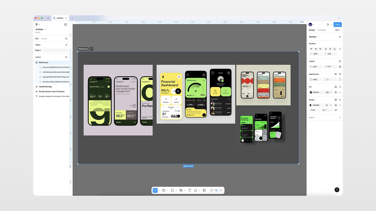
Downloading 2-4 screenshots with the same style is a good idea.
Having consistent inspiration is more important than having a many options.
Step 2: Uploading UI Design Screenshots to Figma
You should have your screenshots:
Go to Figma
Click Plus → Figma Make
Drag your screenshot(s) to the Make window
Or click the frame and select Send to Figma Make
If the screenshots have the same design style. you can upload several.
Step 3: The Game Change Prompt
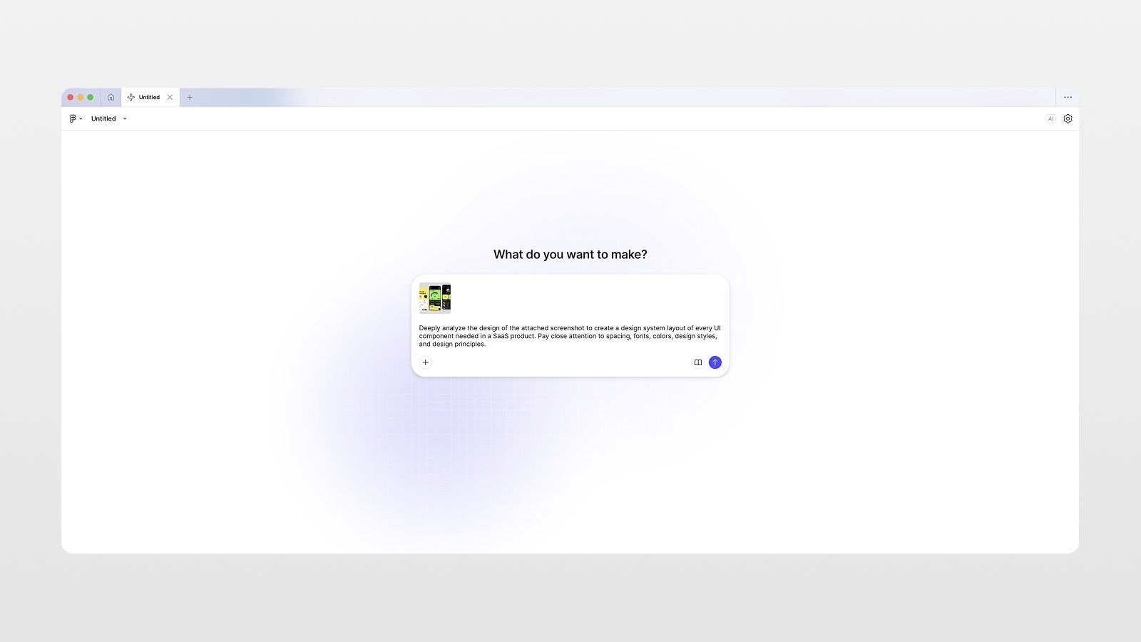
This is the type of prompt justify to be the Figma Make game changer:
Deeply analyze the design of the attached screenshot to create a design system layout of every UI component needed in a SaaS product. Pay close attention to spacing, fonts, colors, design styles, and design principles.
Reasons for working:
You are not asking for conceptual design, but rather design analysis.
You are not asking for decoration.
Rather than focusing on one screen, you are creating a system.
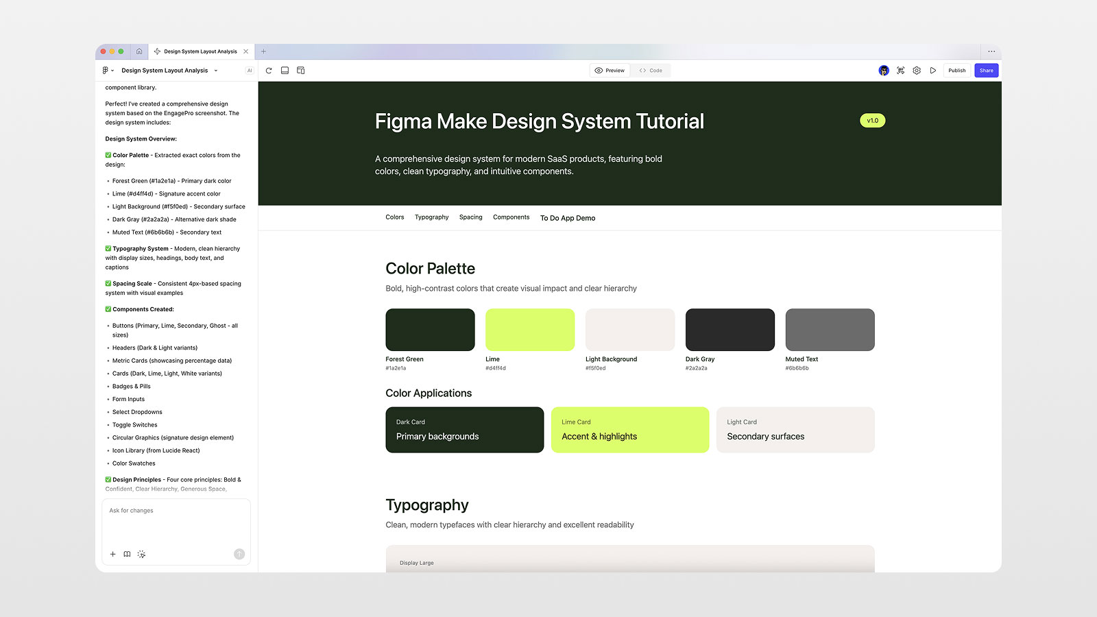
What Figma Make Generates (And Why It’s Powerful)
After processing, Figma Make creates a fully structured web-based design system, including:
Color System
primary colors
semantic usage
light/dark variants
Typography Scale
display sizes
headings
body text
font weights
Spacing & Layout
spacing scale
padding rules
consistent gaps
Components
buttons (with states)
cards
dropdowns
toggles
navigation
metric blocks
Bonus: It’s Real Code
Everything is generated as a React-based web app, not just visuals.
That means:
developers can reuse it
components are interactive
it can be published or shared
This alone can save days of manual work.
Step 4: Bringing the Design System Back Into Figma
This is the blessing part for the designers.
Using Copy Design, you can paste the generated system directly into your Figma file.
Now you can:
select real components
inspect spacing values
see font sizes
analyze layout logic
This will become your single source of truth.
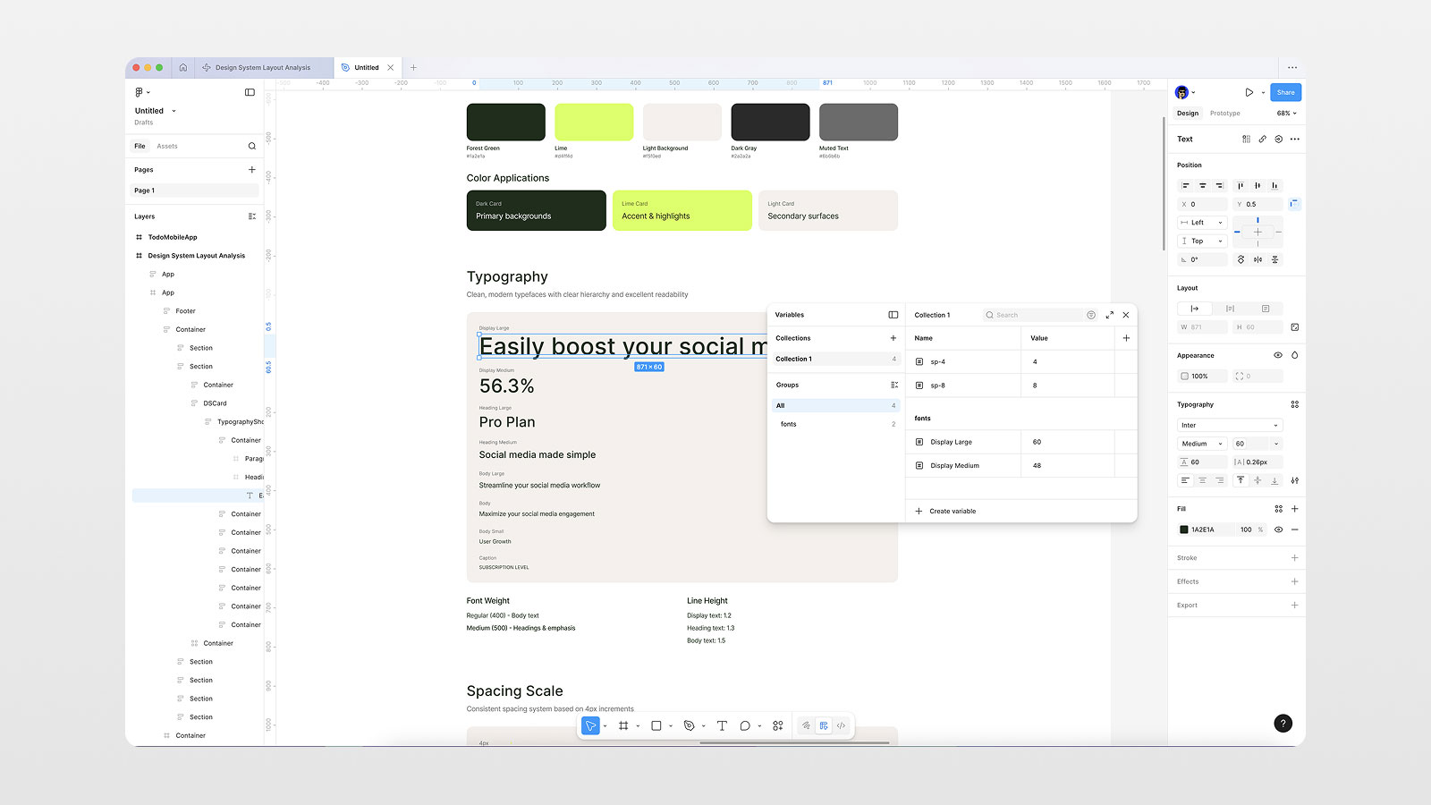
Step 5: Use AI Output For Your Design Variables
Rather than define everything yourself, use AI outputs.
Defining Spacing Variables
Determine your spacing values by using 4, 8, 16, and 24 as options.
In Figma, create number variables.
Use these variables for spacing, padding, margins, and gaps.
Defining Typography Variables
Display Large (e.g. 60)
Display Medium (e.g. 48)
Body sizes
Now your design system can be:
consistent
scalable
structured
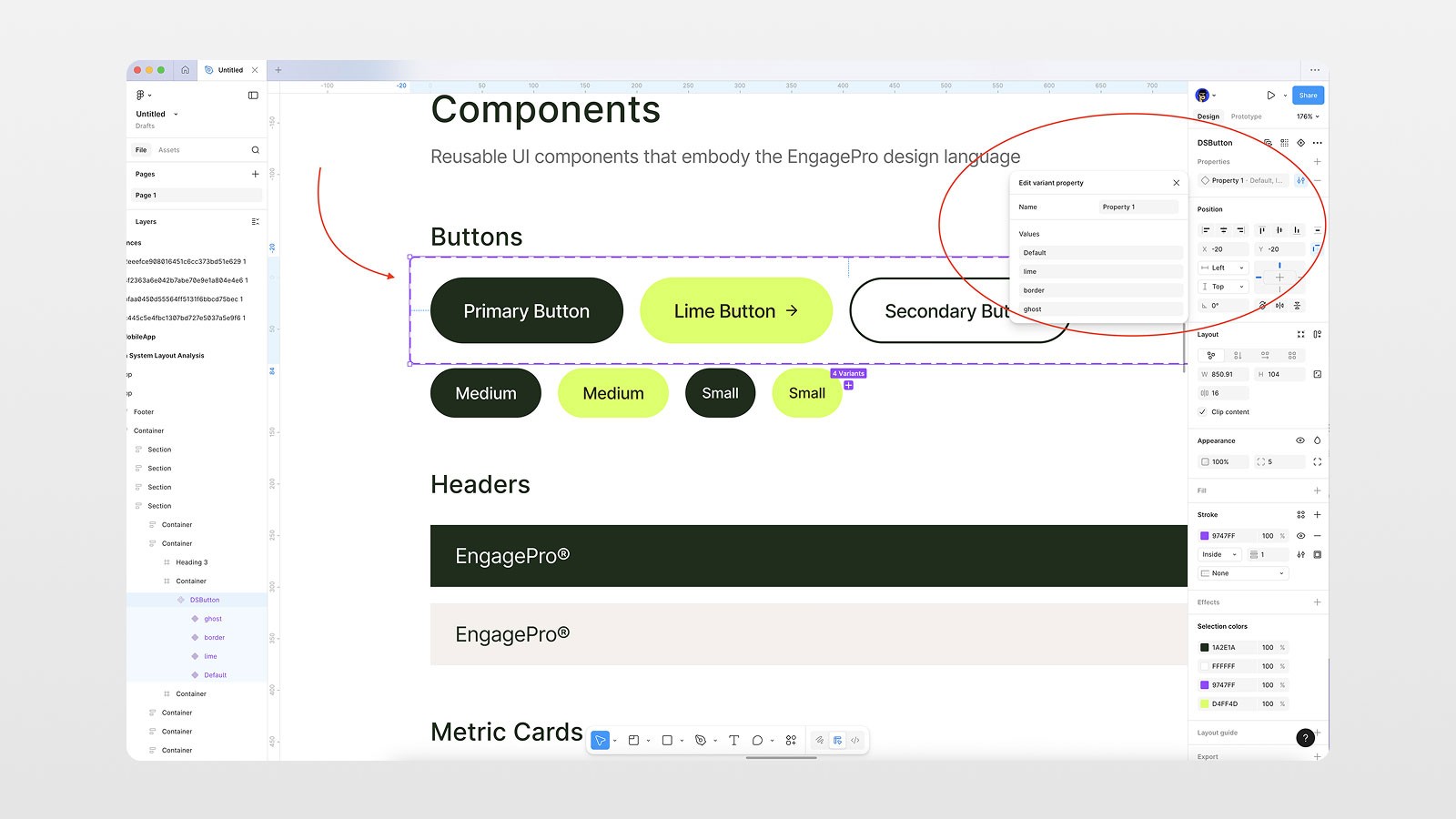
Step 6: Turning Components into Reusable Sets
Let's use buttons as an example:
Use the selection tool to select all the different button states.
Create/component set them together.
Add these variants:
primary
outline
ghost
With this, you'll be able to change styles at ease, as if you're using an actual design system.
Step 7: Using Your Design System To Create App Layouts
Once your design system is built, ask Figma to design new screens from your system using the command Make.
Prompt example:
Create a mobile home screen for a to-do list app using the same design system and visual style.
This will give you a screen with:
interactive and responsive layouts
consistent color use
reused design components
functional components with interactivity
The example video shows an app with a screen that included:
a task list
task list with progress tracking
mobile responsive UI
You did all this from a single screenshot!
Why This Workflow Beats Traditional AI Prompting
Prompt-Only AI | Reference-Based AI |
|---|---|
Generic output | Premium results |
Guesswork | Pattern analysis |
Inconsistent UI | Scalable system |
One-off screens | Reusable components |
This is how AI becomes a design accelerator, not a design replacement.
Actionable Tips You Can Apply Today
Never prompt AI without references
Use screenshots, not descriptions
Ask AI to analyze, not invent
Always extract variables and components
Build systems first, screens second
Conclusion: AI + References = Real Design Power
The tools that AI has access to like Figma Make are truly remarkable — but this only works if you know what you are doing.
If you feed AI actual UI screenshots, you:
remove the need to take a shot in the dark
pull out repeatable patterns in design
create scalable systems in design
design more beautiful layouts in record time
If you want to see this entire workflow in action, step by step:
👉 Watch the video on my YouTube channel
📌 If you want to learn more, don’t forget to book a mentor session for more practical tutorials on Figma, Framer, and AI-powered design workflows.
FAQs
Why do AI-generated UI designs look generic?
Can I use screenshots legally as inspiration?
How many screenshots should I use with Figma Make?
Is Figma Make available on free plans?
Can developers use the output from Figma Make?