AI can produce user interface layouts in a matter of seconds. However, as you’ve likely already noticed, most AI generated UIs have issues. Most end up looking, clean, polished, but forgettable.
If you’ve used Figma Make and thought “Why does this look like every other app on Dribbble?” then this article is made for you.
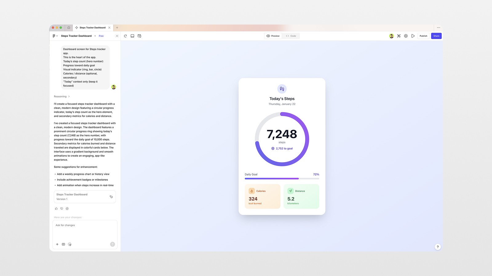
I’m going to show you one workflow for Figma Make to show you how to use it intentionally, not as a shortcut, but as a design accelerator. No need to rush through AI by cutting corners. Using a design system, AI, and a few solid references, I’m confident we can get you from a rough concept to cohesive and polished UI design. This article will be focused on an iOS step tracker app, specifically one screen at a time, as shown in the video.
By the end of this article you will learn how to:
Manage the use of AI and still maintain your design palette.
Achieve a structure while pulling from inspiration, not through copy-pasted visuals.
Create layouts that are consistent and ready for development.
Get your designs ready for tools like Cursor to hand off to Engineers.
Now, let's create a design that we can be proud of and not just an AI design.
Why Most AI-Generated UI Feels Generic
The issue isn't about AI. It is about how we communicate our requests.
When designers use overly simplistic prompts such as, "Design a dashboard for a fitness app," the AI tries to make educated guesses, but defaults to its worn out go to patterns. This leads to the same layouts, empty defaults, and dead visuals.
AI is most effectively used when you set certain boundaries, use visual references, and think of the AI as a junior designer, not as someone you give orders to.
That change in thinking makes all the difference.
Step 1: Start with a Real Product Plan (Before Opening Figma)
Before starting on Figma make, the very first thing I did was product planning.
I used ChatGPT to detail:
Main screens for an MVP steps tracker app
Empty state screens
Important features for each screen
This brought the screen count to 7-8, including:
Dashboard
Activity & History
Profile & Settings
Why this is important: the output from AI tools is drastically more effective when the tools have context on the design and the reason behind it. You aren't designing screens; you are designing flows.
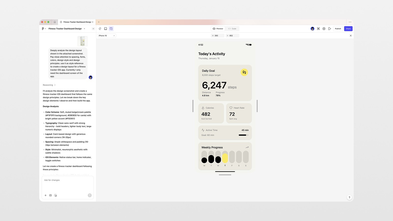
Step 2: Use Design References the Right Way
Next up was inspiration. I discovered a minimal UI on Pinterest that had soft gradients, glassmorphic design, clean typography.
The key here is that I set the reference to avoid straight copy construction. This is a style signal.
Instead of saying "make it look like this" I inquired:
What is the spacing logic?
How do the colors interact?
What is the visual hierarchy?
This reference became the foundation for everything that followed.
Step 3: Prompt Figma Make Like a Designer
Inside Figma, I selected the reference image and sent it directly to Figma Make.
The prompt focused on analysis, not output:
Deeply analyze the design layout shown in the attached screenshot. Pay close attention to spacing, fonts, colors, and design principles. Use it as a style reference to create a dashboard screen for a fitness tracker iOS app.
Changing the focus to analysis is key here.
The Result
Figma Make returned:
A solid layout structure
Reasonable spacing
Clear component hierarchy
Was it perfect? No.
Was it usable? Absolutely.
AI gave me the skeleton. My job was to give it taste.
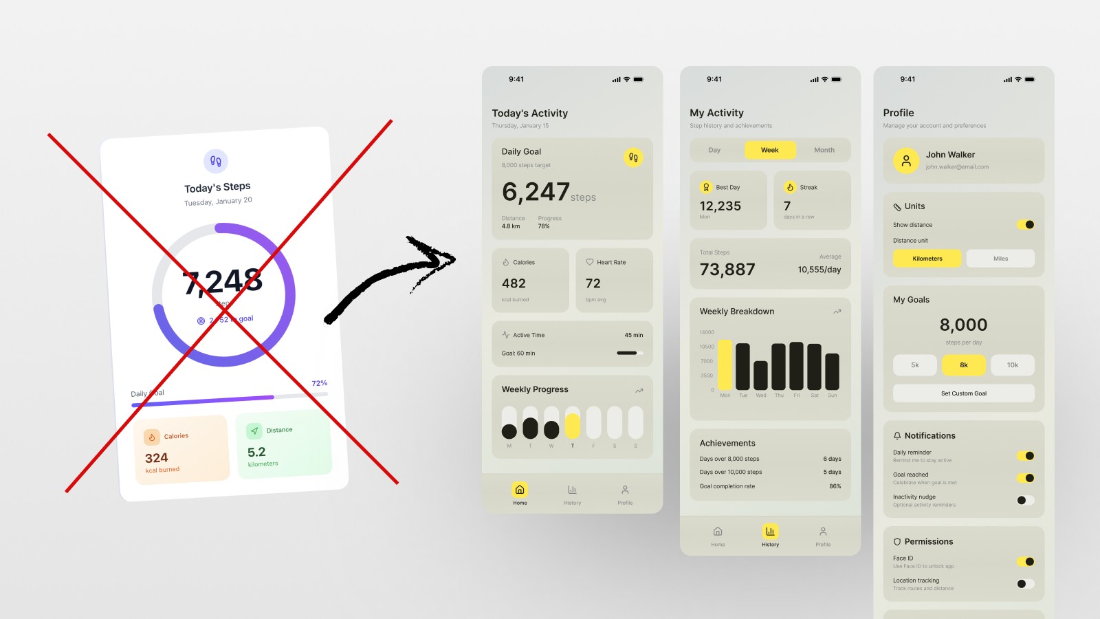
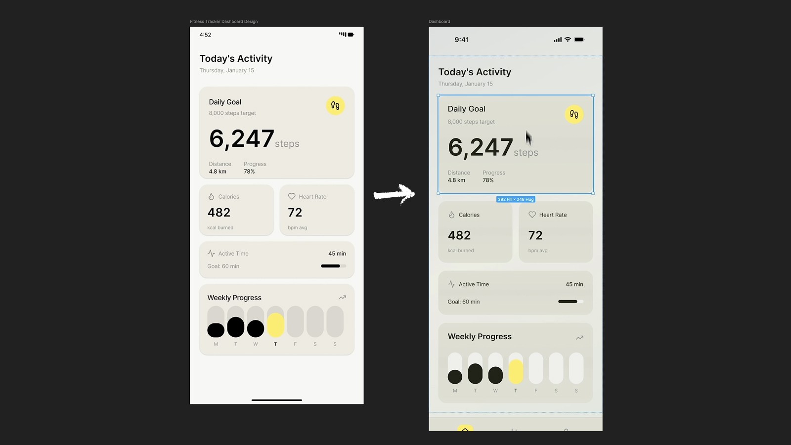
Step 4: Refine the Design Manually (This Is Where Quality Comes From)
After copying the layout that was auto generated into my main design file on Figma, I aesthetically adjusted my layout.
Added color to the backgrounds
Added an overlay to the shadows
Changed the style of some of the cards
Added some spacing where it was empty
The design started to not look AI generated.
This is why many of the designs that people try and make using AI are not of high quality and look very average.
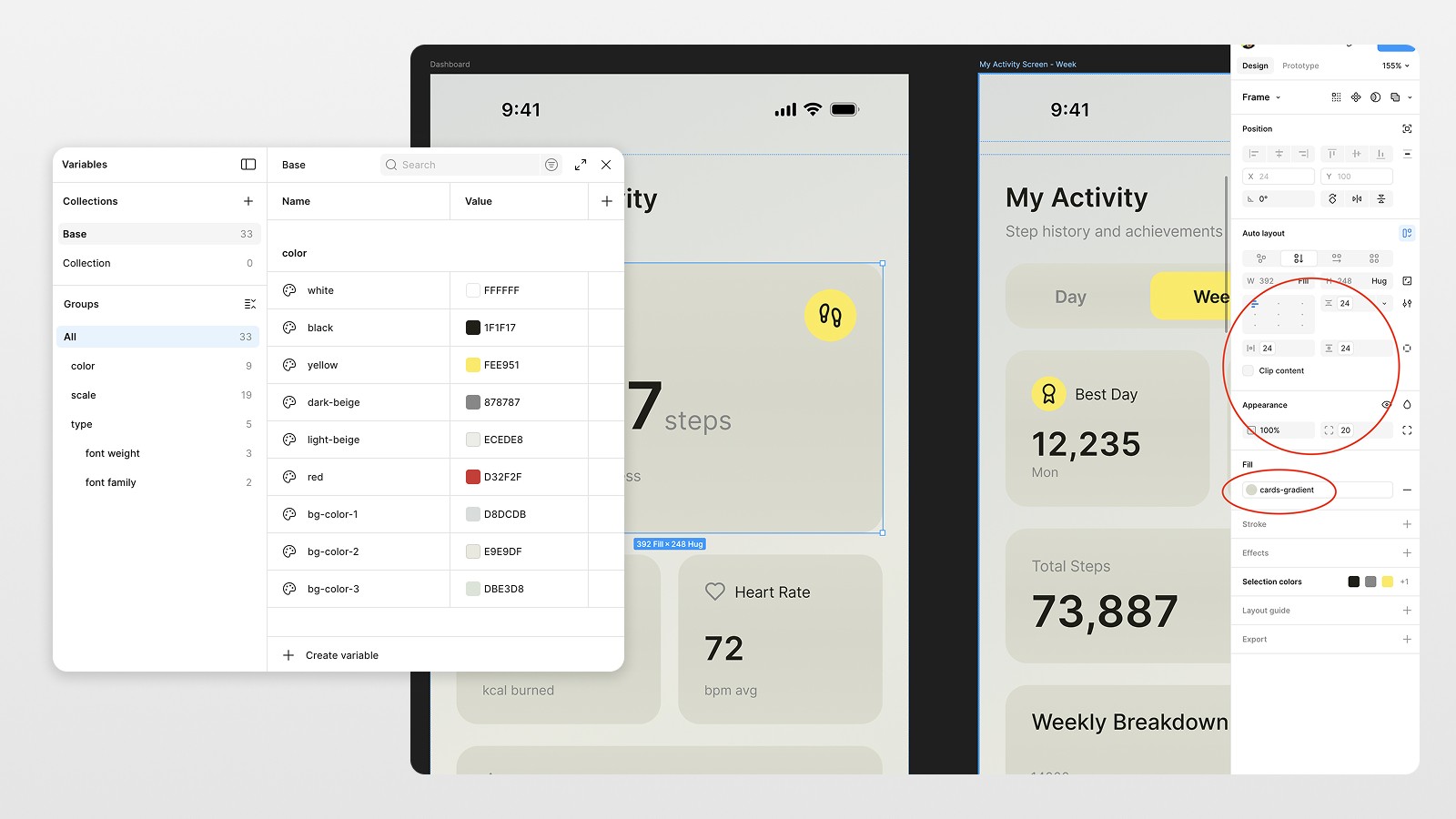
Step 5: Set Up Auto Layouts, Variables, and Styles Early
Probably the most vital choice was converting the majority of the designs into:
Auto Layouts
Variables
Styles
Why?
Because this design wasn’t meant to stay static. It was meant to:
Scale to more screens
Be exported to code
Be reused by developers
Aimed at systems, buttons, cards, navigation bars… everything.
A Quick Pro Tip
In Figma, gradients still can't be set in variables, so while using variables for colors, spacing, and typography, I left gradients as styles with using color variables for gradient color structure.
This saves a lot of headaches later, so it's a minor compromise.
Step 6: Generate Additional Screens Using the Updated Design
Now comes the fun part.
Rather than having Figma Make start over again, I
Selected my modified dashboard screen.
Sent it to Figma Make.
Requested a new screen based on this specific design.
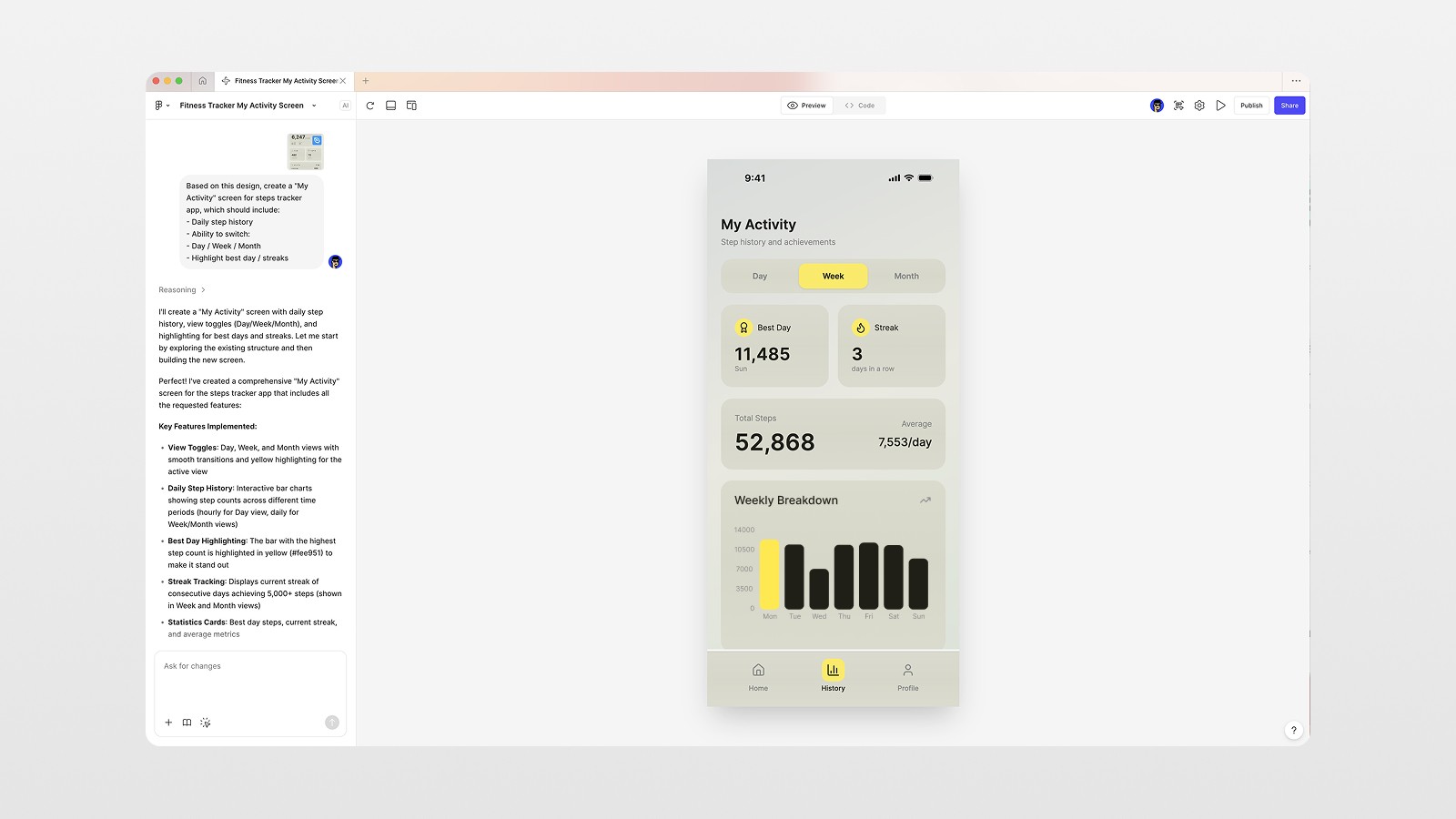
As an example, the Activity & History screen prompt included:
Daily step history
Day/week/month toggles
Highlighted best days and streaks
The result? A new screen that:
Worked with the same gradients
Matched the typography
Followed the same layout logic
This is where AI really shines, when it extends a system instead of having to invent one.
Step 7: Build Navigation and Components with AI + Manual Control
Bottom navigation came next.
I asked Figma Make to generate a bottom bar with:
Home
History
Profile
It even included subtle animations and state changes.
From there, I:
Turned it into a reusable component
Connected it with variables
Applied it consistently across all screens
Same approach for toggles, selectors, and repeated UI blocks.
Step 8: Save Time by Importing Design Tokens
If you already have a design system, don’t rebuild it.
I exported system variables (such as spacing scales, typography, etc.) from a previous design system and imported them into this file using JSON.
This gave me:
Spacing consistency
Typographic predictability
Less design rethinking
This step alone can save you hours.
Step 9: Final Screens and Developer-Ready Output
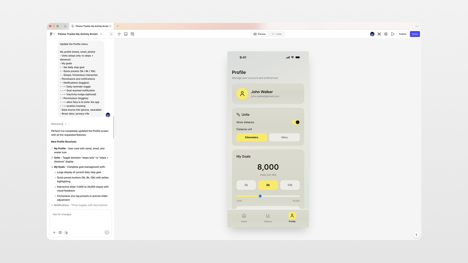
The last screen was the Profile part, and it contained:
Goal setting
Unit switcher (km / miles)
Preferences
The full app was done after one follow-up prompt and a quick clean-up.
At this stage:
Variables were consistent across screens
Components could be used multiple times
Styles were consistent
The design was ready to be:
Exported to Cursor
Handed off to a developer
Used as a base for future iterations
What This Workflow Really Teaches
Designers would still be needed even with tech like Figma Make.
Designers who know how to construct prompts for AI will definitely be better than those who don’t.
AI won’t replace designers, though it will replace the need for poor designers. Taste will be the bottleneck as it always has been.
Key Takeaways You Can Apply Today
Begin with a product plan
Use references for analysis, not for copying
Request reasoning, not just images
Edit AI output
Set up systems early (variables, components, auto layouts)
When you do this, your AI-assisted designs won’t look generic. They’ll look purposeful.

Figma Make is powerful — but only if you treat it as a partner, not a machine.
When you combine clear intent, strong references, and good design systems, AI becomes a force multiplier. You move faster and maintain your standards.
👉 Watch the full video to see the entire workflow step by step and follow along with the actual files.
And if you want to learn more about Figma, Framer, and how to build real products with AI — book a design session with me below.
FAQs
Is Figma Make good for real app design?
Why do AI-generated designs look generic?
Can I export Figma Make designs to code?
Should I use variables in Figma Make projects?
Do I still need design skills if I use AI?