Let’s be honest for a second. AI can now build pretty much any interface you describe to it. A dashboard, a settings page, an onboarding flow, all from one prompt. That part still blows my mind a little 🤯
But there’s a catch you’ve probably noticed too. A lot of AI-generated UI still looks AI-generated. You open the result, it’s clean, it works, and at the same time you feel like you’ve seen it a thousand times already.
So I ran a small experiment. I asked Claude Code, running its top model Fable 5.1, to design an entire SaaS product with zero references. Then I connected it to Mobbin, a huge library of real product screens, and asked it to do the job again. Same AI. Same product. The only thing I changed was what the model could learn from.
In this article I’ll walk you through what happened, why the first version felt so generic, what changed in the second one, and a workflow you can steal for your own projects. If you design with AI tools (or you’re about to start), this one’s for you 🙏
I've covered adjacent workflows before — including how to build a SaaS product with AI and the Claude Code design skill — but this one is specifically about killing the generic AI look with real references.
The Experiment: Building "Pulse" Twice
The product was a SaaS analytics platform I called Pulse. The setup was simple:
Tool: Claude Code
Model: Fable 5.1, on low effort (for this kind of task, low was completely enough)
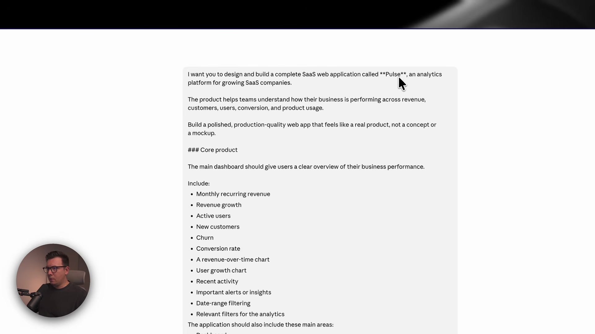
Version 1: One prompt describing the core dashboard features, with the design direction left to the AI. I only asked for something “modern, professional, sophisticated, highly usable.” Pretty standard stuff.
Version 2: Same agent, same product requirements, but now with access to Mobbin through its MCP connection, plus a prompt that told it to research first and design second.
Keeping everything else identical was the whole point. If the second version came out better, it wouldn’t be because of a smarter model or a better feature list. It would be because of the references.
Version 1: Impressive… and Painfully Familiar
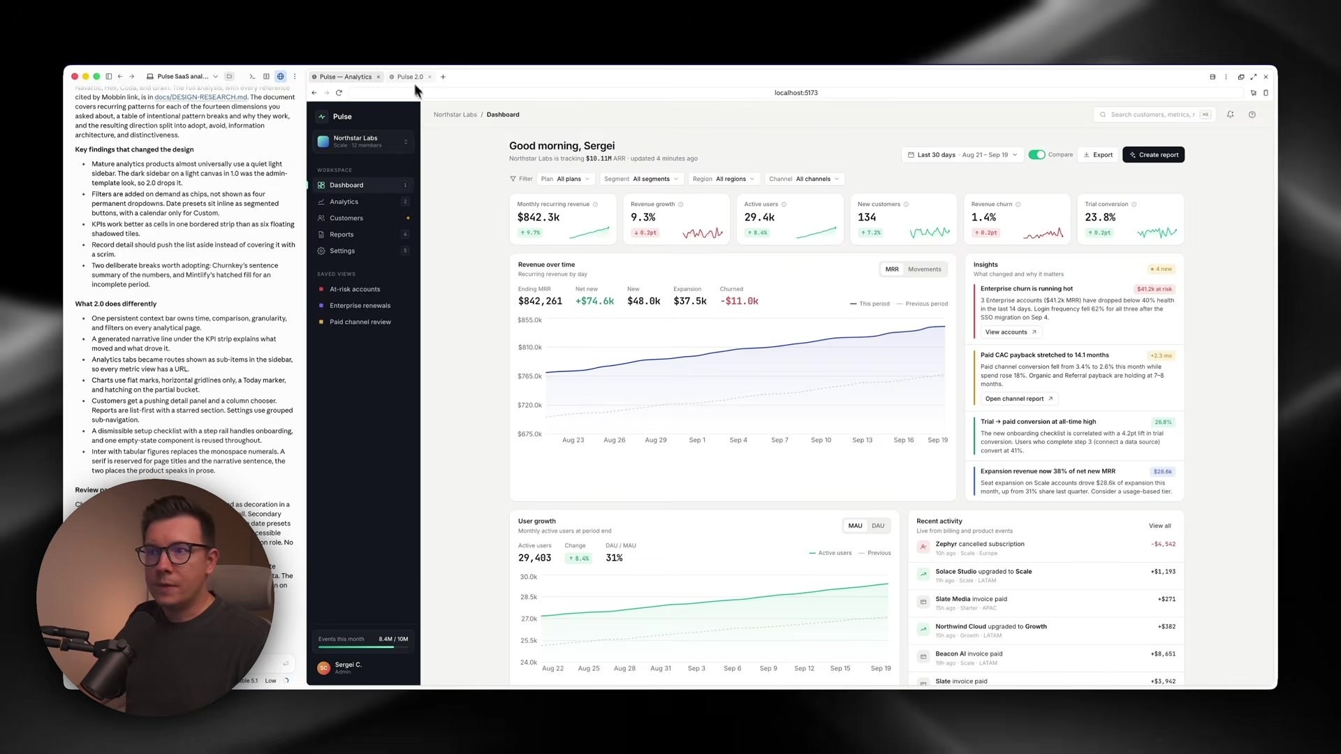
I’ll give credit where it’s due. Version one was genuinely impressive. Claude Code built every screen, gave me a summary with screenshots, and the app had demo functionality working. Connect real data and you could honestly ship it as an MVP.
But the longer I looked at it, the more I recognized it. Not as my product, but as every product 😅
Here’s what gave it away:
Thin 1px gray strokes everywhere. AI loves these borders for some reason.
The same corner roundness you see on every AI dashboard.
Beige-ish colors. Claude in particular seems to love them.
Generic tabs and buttons that look straight out of a default UI kit.
Filler content like a “Good morning, Sergei” greeting. I know my name. It doesn’t help me do anything.
Clunky filters. To change the date range, you had to open a calendar and dig for presets, plus deal with extra dropdowns.
And this is the real problem with most AI-generated UI right now. Fable can build interfaces. But where were the design decisions coming from? Basically nowhere. The model was pulling from a generic UI kit baked into its habits, and that’s exactly why so many AI-built apps look the same.
Why AI Websites Look the Same (and It's Not the Model's Fault)
This is the insight I want you to take from the whole experiment.
When you ask AI to design something from scratch, it has to make dozens of visual and UX decisions with almost no context. Which navigation pattern? How dense should tables be? Where do settings live? How should filters work? Without context, the model falls back on the safest, most average answer it knows. Multiply that by every decision on every screen and you get the “AI design look.”
Think about how a human product designer works. They don’t sit in an empty room inventing a dashboard from nothing. They look at how great products solve the same problem. They study patterns, notice what works, and then make their own choices.
So the question isn’t really “can AI design something good?” The better question is: can AI research how great products solve this problem, understand the patterns, and then create something original?
That’s what version two tested.
Connecting Mobbin MCP to Claude Code
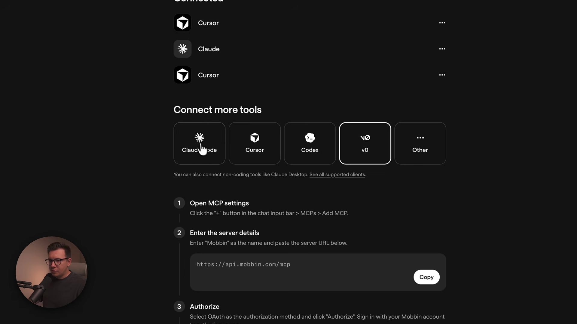
If you haven’t used it, Mobbin is a platform with hundreds of thousands of screens and user flows from real products. The key part for this workflow is the Mobbin MCP, which lets your AI agent search that library directly instead of you screenshotting things and pasting them in.
Setup took about a minute:
In your Mobbin account, open your profile and find the MCP section. There’s a guide for different agents (Claude, Cursor, and others).
If you’re using Claude, go to Settings → Connectors, search for Mobbin, install it, and authorize your account. No terminal needed, because Mobbin is available in the marketplace for both Claude and Cursor.
If you’re using Claude Code in the terminal, just paste the command from Mobbin’s MCP guide.
The Research-First Prompt (This Is Where the Magic Is)
The second prompt is honestly the most valuable part of this whole experiment. It didn’t just say “use Mobbin.” It gave the agent a proper design process:
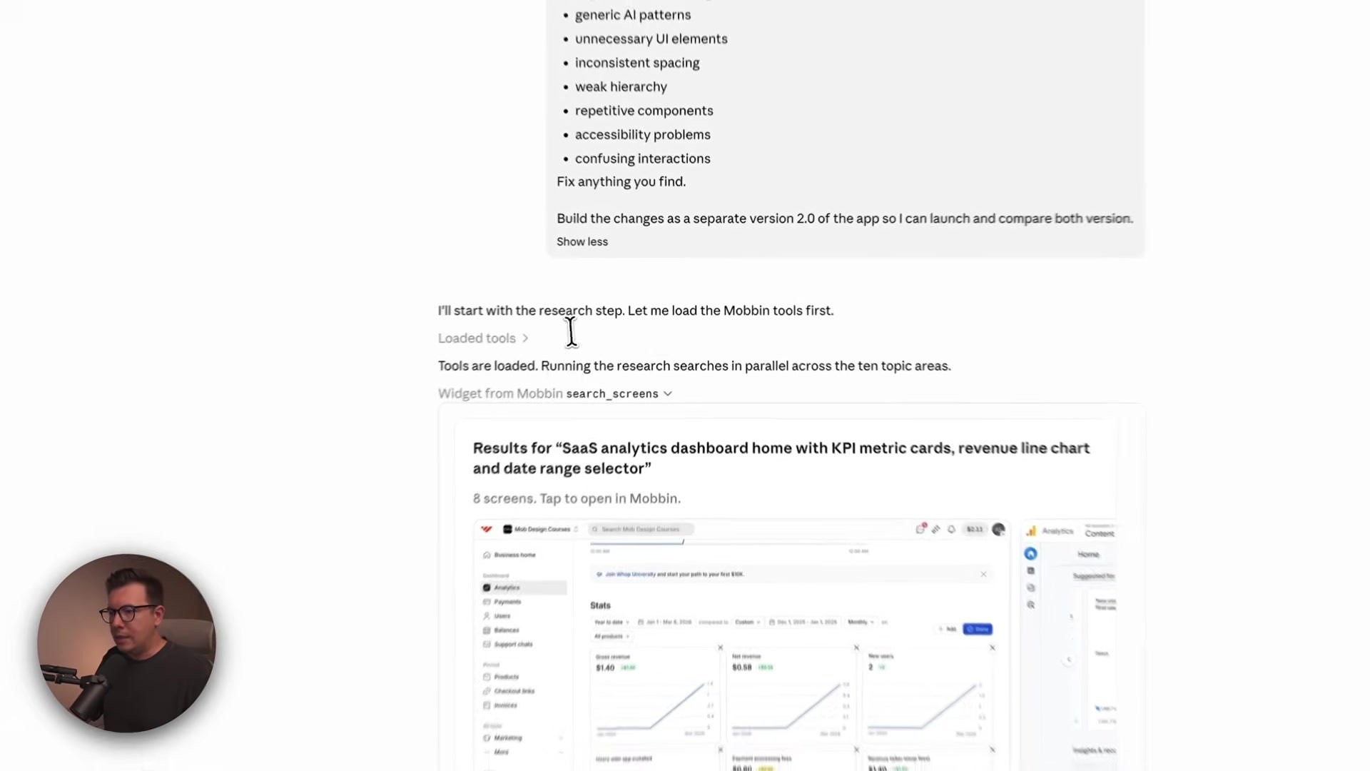
Research. Search Mobbin for relevant references, like SaaS analytics dashboards and business intelligence dashboards. I told it exactly what to look for.
Analyze patterns, don’t copy. Study the references to understand why they work. No cloning any single product. We’re using real designs as reference to build something unique, not stealing anyone’s work.
Create a design direction based on those findings.
Redesign the app while keeping the exact same product requirements and functionality. Nothing new invented. And pay special attention to the areas that felt generic in version one.
Apply the system to every page, so the design stays consistent.
Review and fix. Make another pass specifically hunting for generic UI patterns and unnecessary elements, and fix whatever it finds.
While it worked, I could actually see it pulling screens from different apps through Mobbin and building a report of what it found. At the end it explained its key findings and what it changed, like turning filters into on-demand chips.
Version 2: Same AI, Completely Different Product
Okay, this is the fun part 😎
A calmer, more intentional look
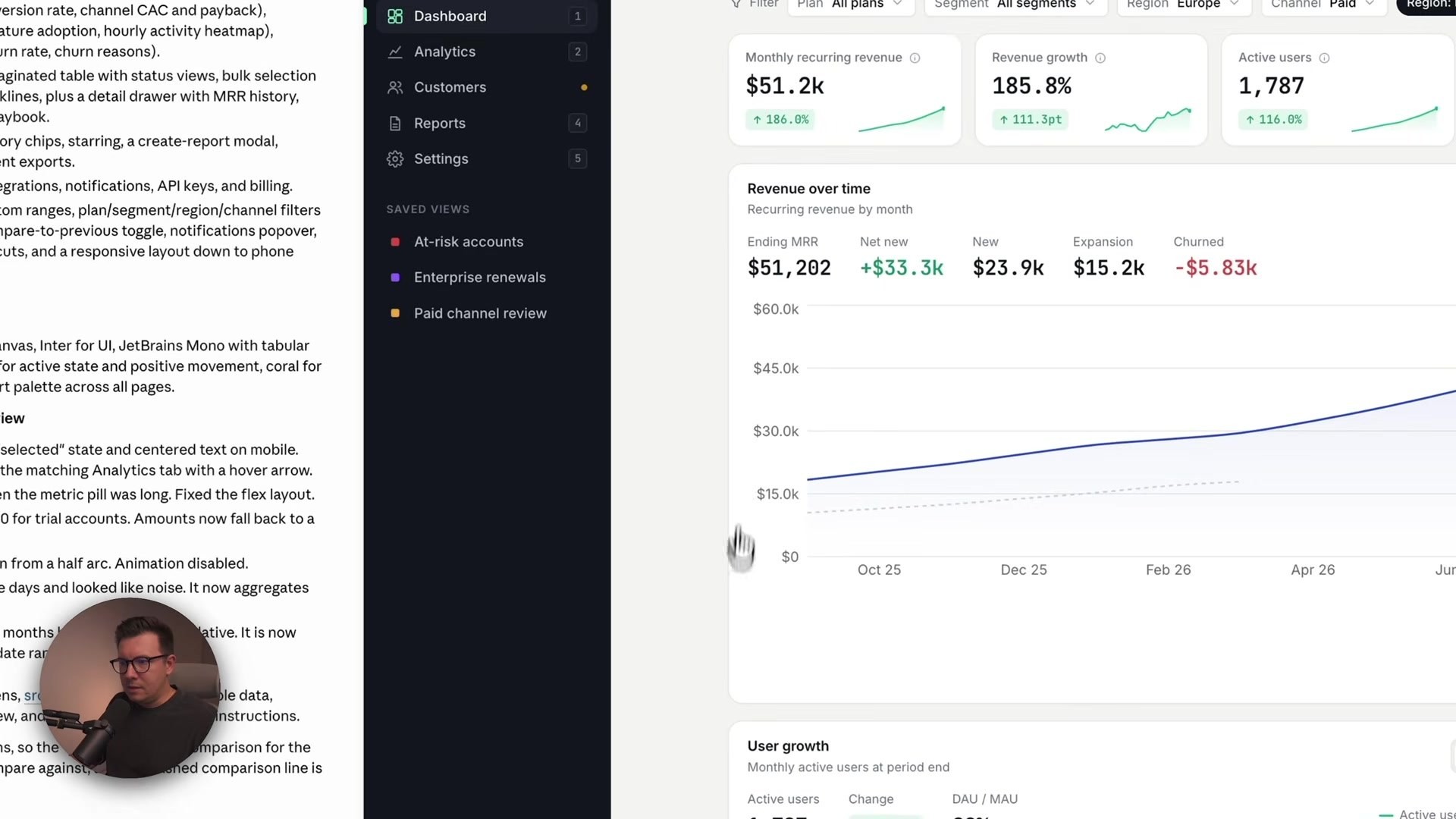
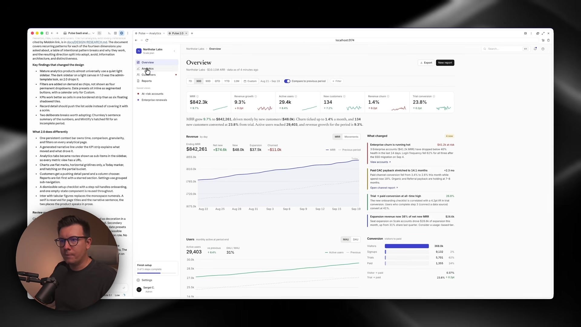
The first impression was just… clean. A very light gray background (the one every designer secretly loves), a switch to serif fonts for headings, and a white collapsible sidebar instead of the heavy black one from version one, which couldn’t be hidden at all.
Filters that save clicks
Date presets now sit right on the page as chips. One click instead of opening a calendar and searching. Custom ranges are still there when you need them.
Features that came from real patterns
Version two added an auto-generated summary of the selected period (like a 30-day overview) that version one never had. I didn’t ask for it. It most likely picked this up from references on Mobbin. The “top accounts” block also got smarter, with background bars showing each account’s size relative to others, so you see the comparison instead of just reading numbers.
Better information architecture
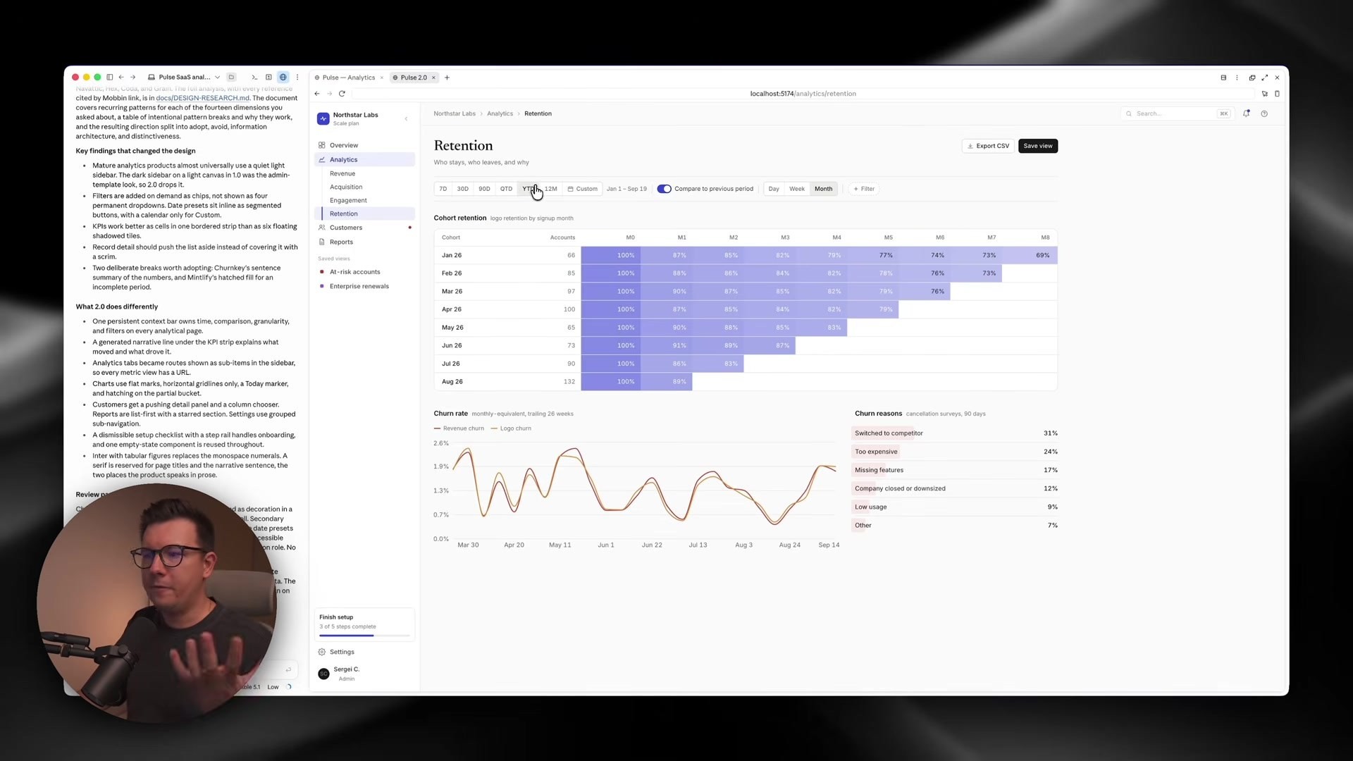
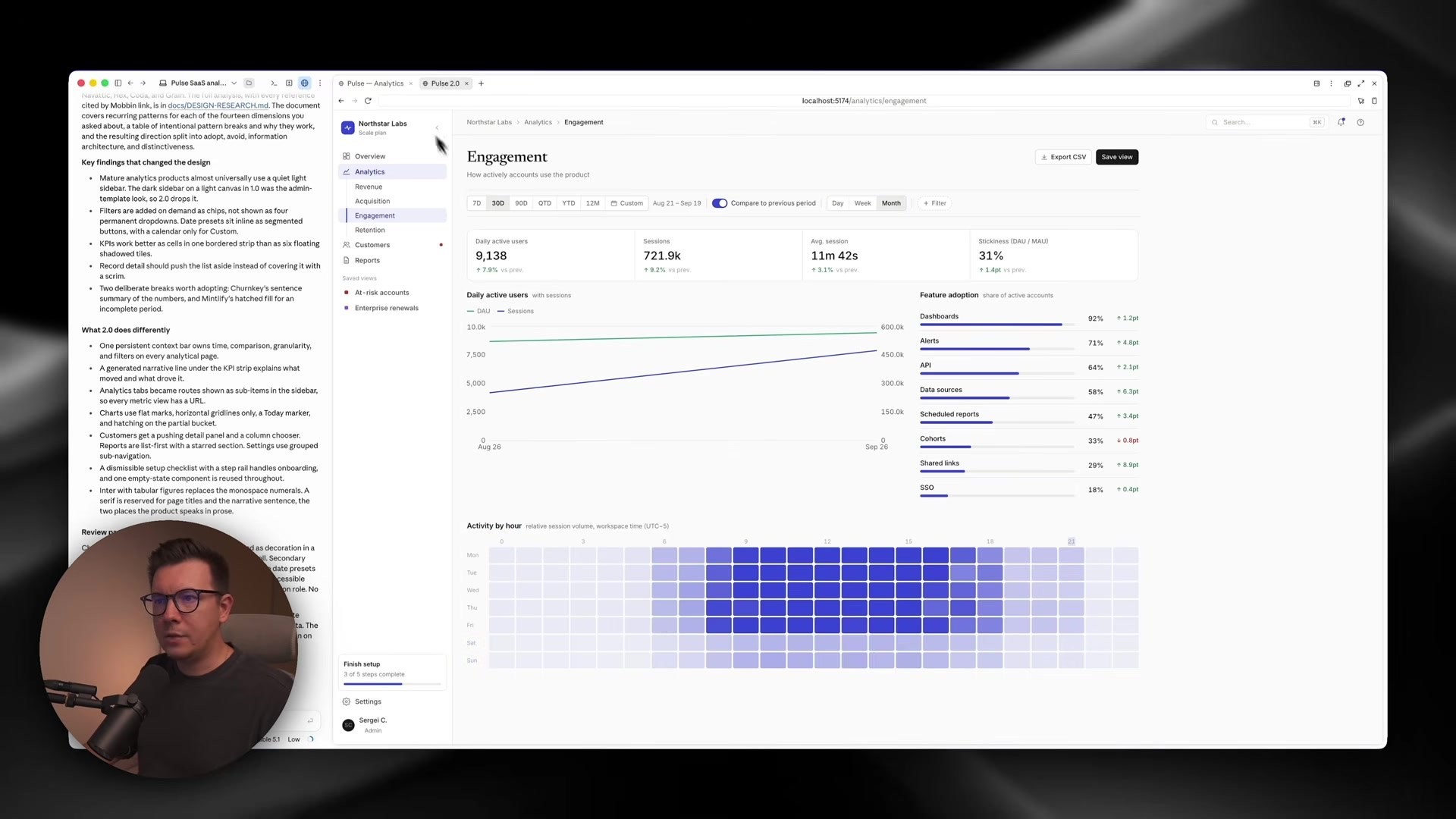
Analytics got split into separate pages: revenue, acquisition, engagement, and retention. There’s an activity-by-hour week view and a retention chart that honestly looks like a finished product. The kind of thing you could show your board or sell as-is.
Smarter UX in the details
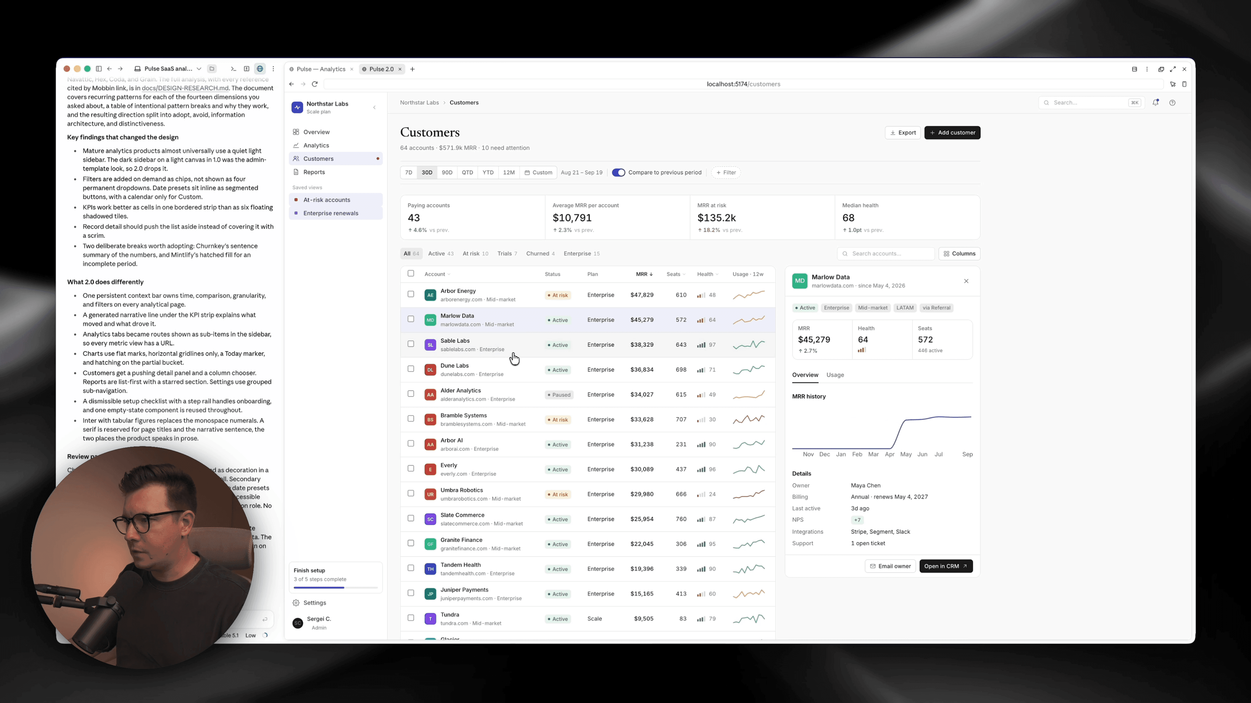
Customers: In version one, opening a customer launched a popup that covered the screen, so you lost the list. Version two keeps everything visible while you browse, and you can toggle table columns on and off.
Reports: Big cards that ate space on small screens became a compact, filterable table view.
Settings: Moved out of the main navigation to the bottom, because let’s be real, you don’t visit settings every day. Inside, workspace, data, and billing are separated instead of dumped into one long list.

The stress test: adding new screens
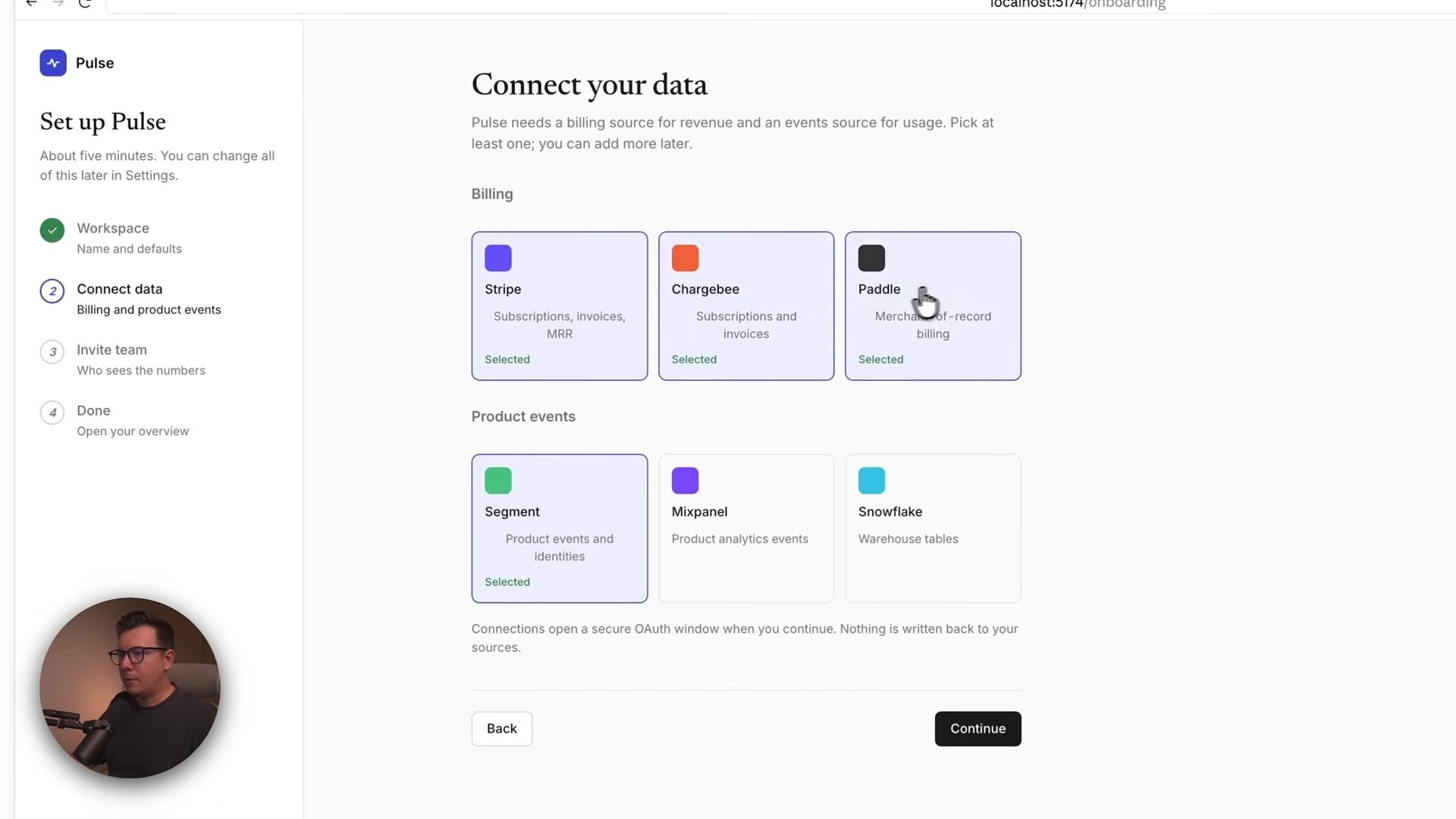
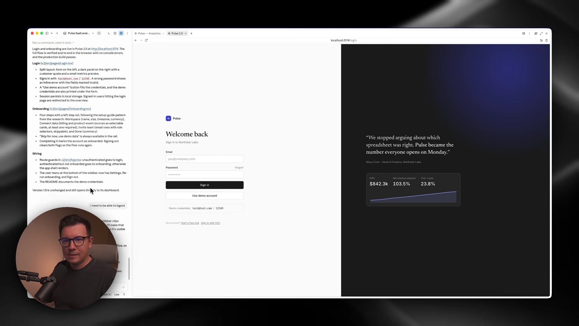
To check whether the new design system actually stuck, I asked Fable to add login and onboarding screens. The result: a split layout with the form on the left and a testimonial-style block with a nice gradient on the right, working validation, and an onboarding flow for company details, connecting tools like Stripe and Snowflake, and inviting teammates. It felt a lot like setting up a Stripe account. And it matched the rest of the app, which is exactly what a real design system should do 🚀
How to Make Your AI-Generated UI Look Less Generic: Actionable Steps
Here’s the workflow boiled down so you can use it today:
Build a functional v1 first. Let the AI focus on structure and features. Don’t fight it on visuals yet.
Audit v1 for “AI tells.” Write down what feels generic: thin gray borders, default radius, beige palettes, filler greetings, extra clicks.
Give your agent a reference source. Connect Mobbin MCP (or another real-product library) so it can research instead of guess.
Name the problems to research. Be specific: “SaaS analytics dashboards,” “B2B onboarding,” “settings pages.” Vague research gives vague results.
Explicitly forbid copying. Tell the AI to extract patterns, not clone products. This keeps the result original and ethical.
Lock the requirements. Keep functionality identical so the redesign improves UX instead of adding random features.
Always add a review pass. Ask the agent to hunt for generic patterns and unnecessary UI after redesigning. This step catches a lot.
Stress-test with a new screen. Request a feature that didn’t exist yet and see if it follows the new system.
Same idea as when I use AI for client sites — whether that's Relume Publish or building a $5k site in under an hour: the tool is fast, but your references and taste decide whether it looks finished.
The Bigger Lesson for Designers
What changed when I connected Mobbin wasn’t that Fable 5.1 suddenly became a human designer. It’s that it finally had real references to reason from. It could look at how actual products handle navigation, dashboards, onboarding, settings, and all those small UX problems, and then use those patterns to make decisions.
And that’s much closer to how good product design actually happens. We’re moving from “AI, generate me a UI” to “AI, research, learn, and then design.” For designers, that’s great news. Your taste and your ability to judge references matter more in this workflow, not less.
If you want more of this kind of process, I keep practical breakdowns on Learn and a living tools list on Resources.
Conclusion
AI-generated UI looks generic for one main reason: the AI is making design decisions without context. Give it a way to research how real products solve real problems, guide it with a clear process (research, analyze, define a direction, redesign, review), and the same model produces something that looks and works like a product designed with intention.
Version one of Pulse was a solid MVP. Version two felt like a product 👀
👉 Watch the full video to see both versions side by side and every screen of the redesign.
And if you want more AI design workflows like this straight to your inbox, subscribe to my newsletter here. 🤗
Try the reference workflow yourself with Mobbin — 20% off the pro plan with that link.
FAQs
Why does AI-generated UI look so generic?
What is Mobbin MCP?
How do I connect Mobbin to Claude?
Does using design references mean the AI copies other products?
Can Claude Code with Fable 5.1 build a full SaaS MVP?
See more from me in Google Search
Add sergeichyrkov.com as a preferred source to get my tutorials and articles highlighted in Top Stories and AI Overviews.